The Environmental Center Website Redesign
My Role:
Development and Interior Page Design
Background:
The Environmental Center needed to rejuvenate their existing website. The branding had grown antiquated, and the site's structure demanded a comprehensive overhaul. Navigational challenges and cumbersome page organization had emerged as significant user pain points. The org also asked us to create a site they could easily update themselves.
Simultaneously, a new initiative named ReThink Waste was on the brink of launch and was eagerly anticipated to accompany the new website. As a community cornerstone, The Environmental Center held its brand identity in high regard, however, a desire for a contemporary and streamlined aesthetic pervaded. The goal was to bring modernity coupled with organization to the new website, along with creating a user friendly CMS for the team.
bEFORE
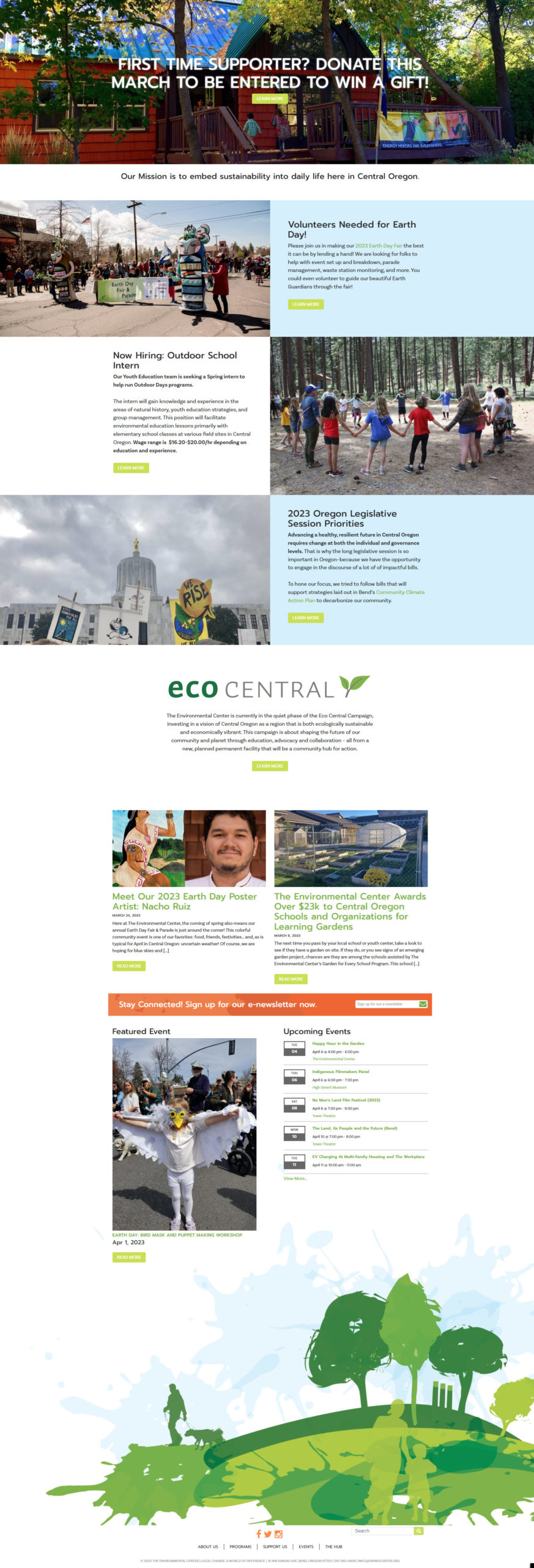
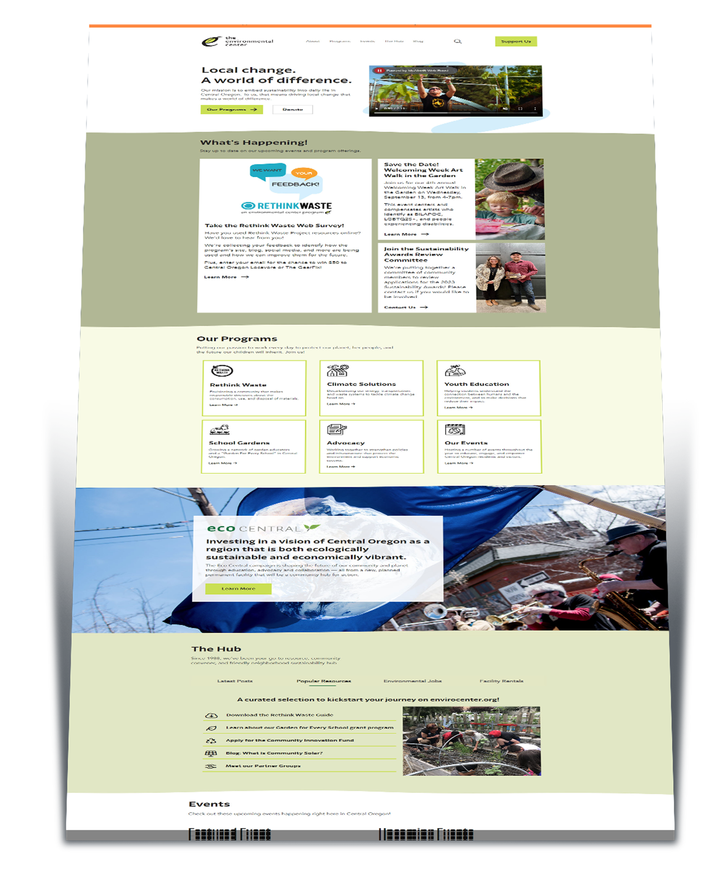
AFTER

The Process
Tackling this project was a challenge because, as with most non-profits, there was a plethora of information on the site. Working with the org, we were able to narrow down the main navigation, and the hierarchy of information to display on the home page.
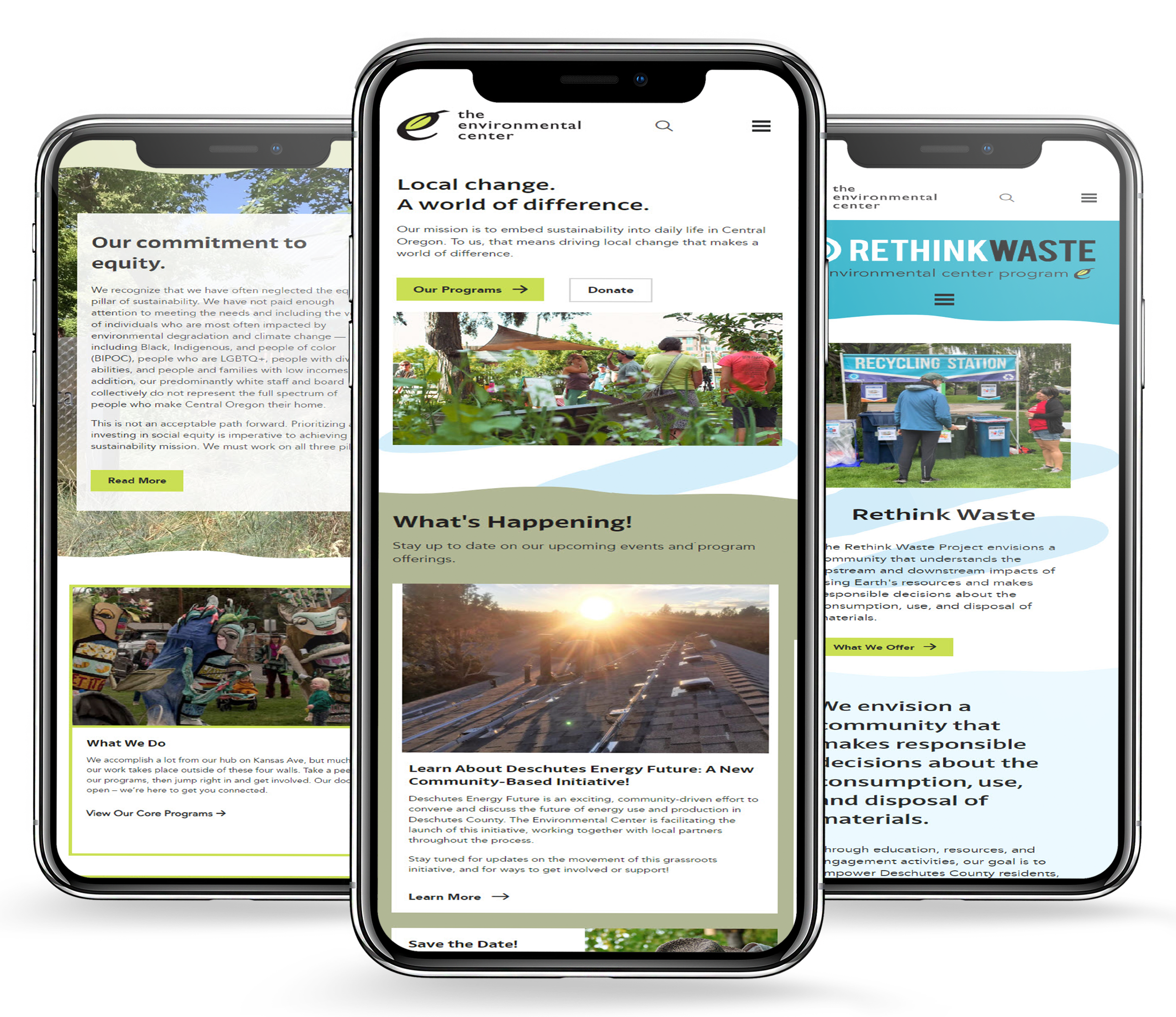
Once the homepage design was approved, I got to work building the site. Creating the waves was the most difficult part because it was hard to get it to look good on a small screen. After a lot of experimentation, the ideal ratio was discovered and saved so it could be easily applied throughout the site.
Another challenge was making sure the color contrast met accessibility standards. The lime green color for the buttons was initially going to have white text instead of black but white against that shade of green didn't pass the contrast checker.
interior pages
header animations
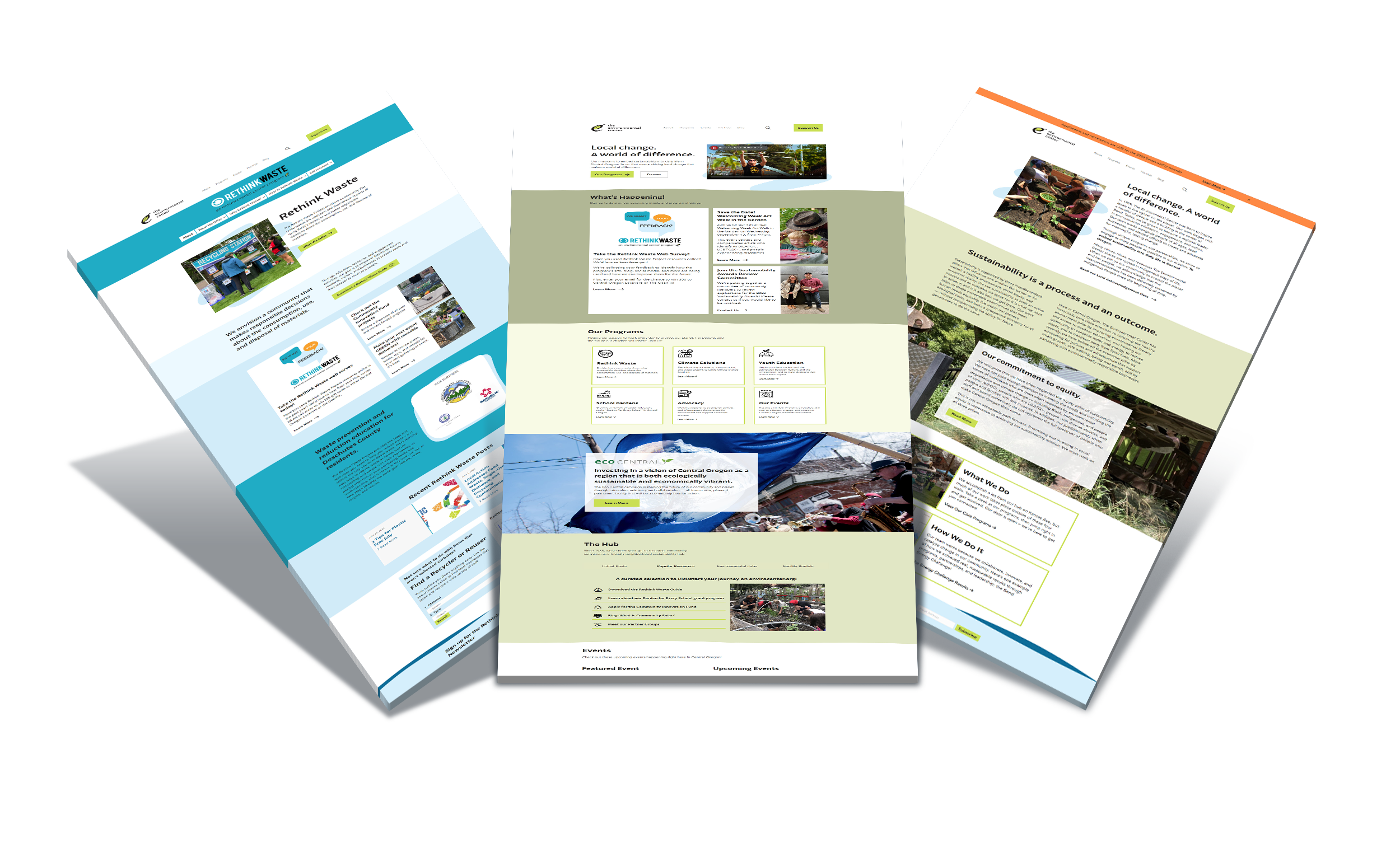
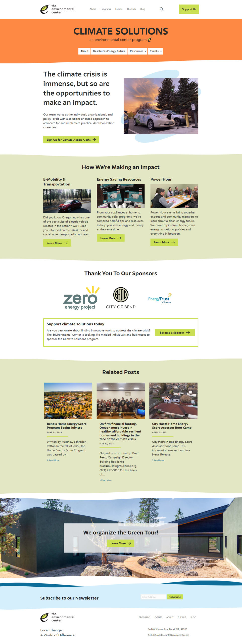
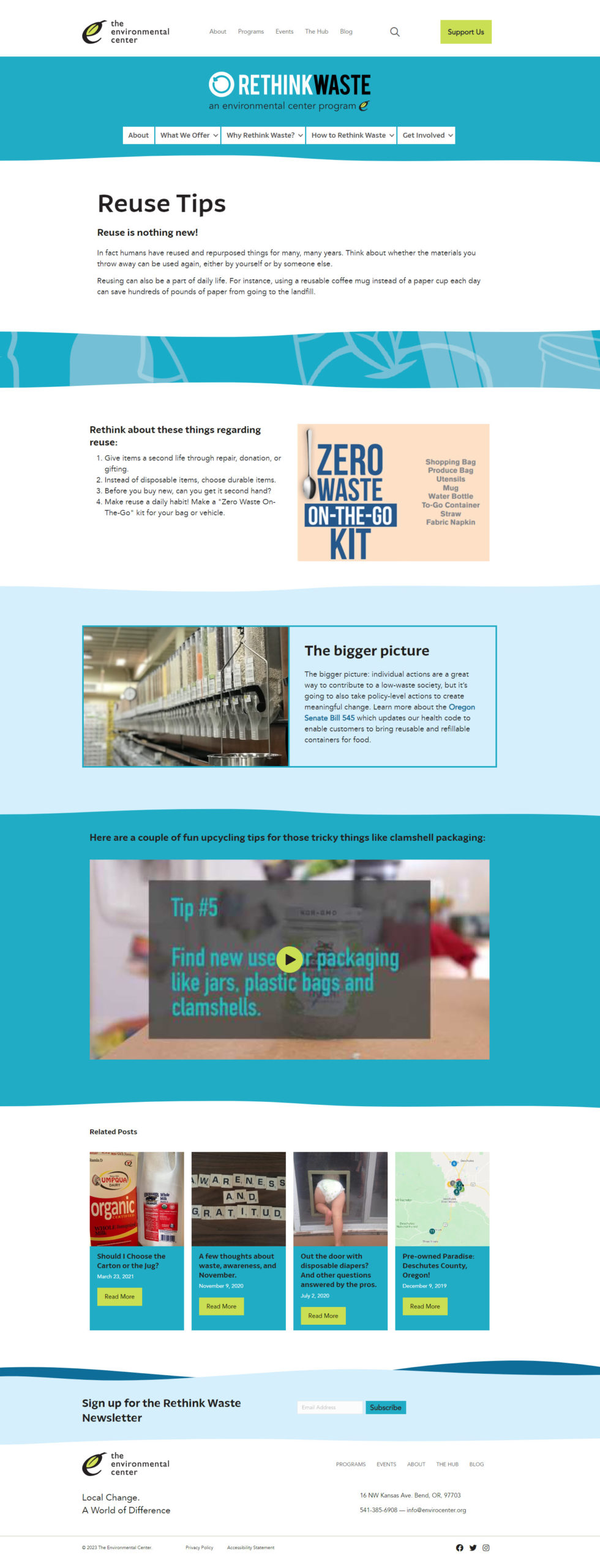
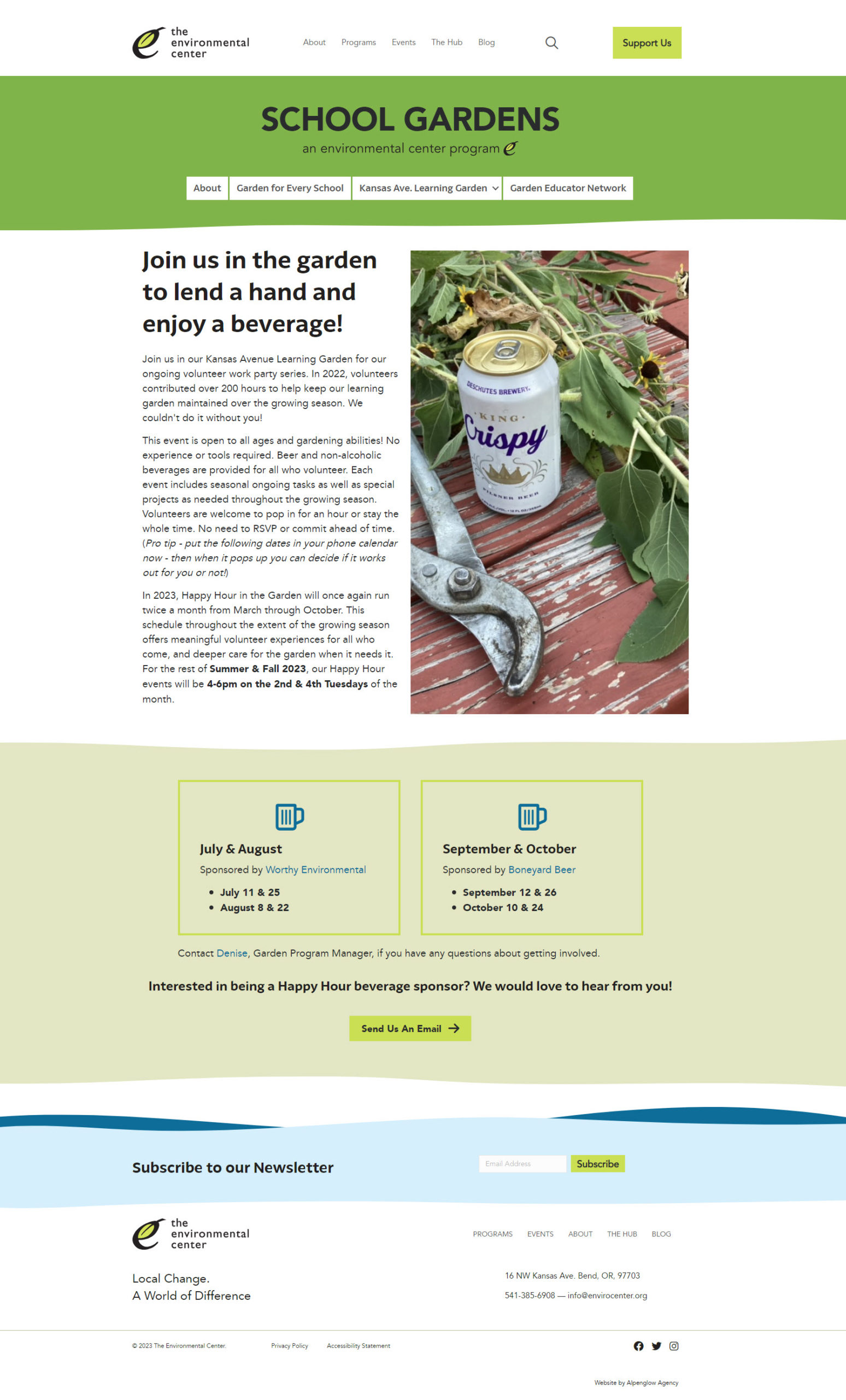
For the interior pages, I used the the new design system to create the pages, incorporating the color blocks and photos, adding waves, and lime green buttons and borders. Rethink Waste had a separate design system, using blues instead of green shades. We decided on a different main color to distinguish each program and created a main sub-page template so the team could more easily maintain the pages.
Animations weren't included in the design so that was something I added. I initially had more but decided against it because I didn't want to over burden the org (they didn't have a dedicated web developer on their team).
Lastly, I made sure the whole site was responsive for different screens.
Mobile Designs
