Terrain Digital Media Website
My Role:
Design and Development
Background:
Terrain Digital Media needed a concise yet impactful landing page for their website. Armed with their logo and copy, they also supplied statistical data that required visualization. The goal was to craft a user-friendly, responsive landing page with an engaging color palette, captivating graphics, and curated photographs.
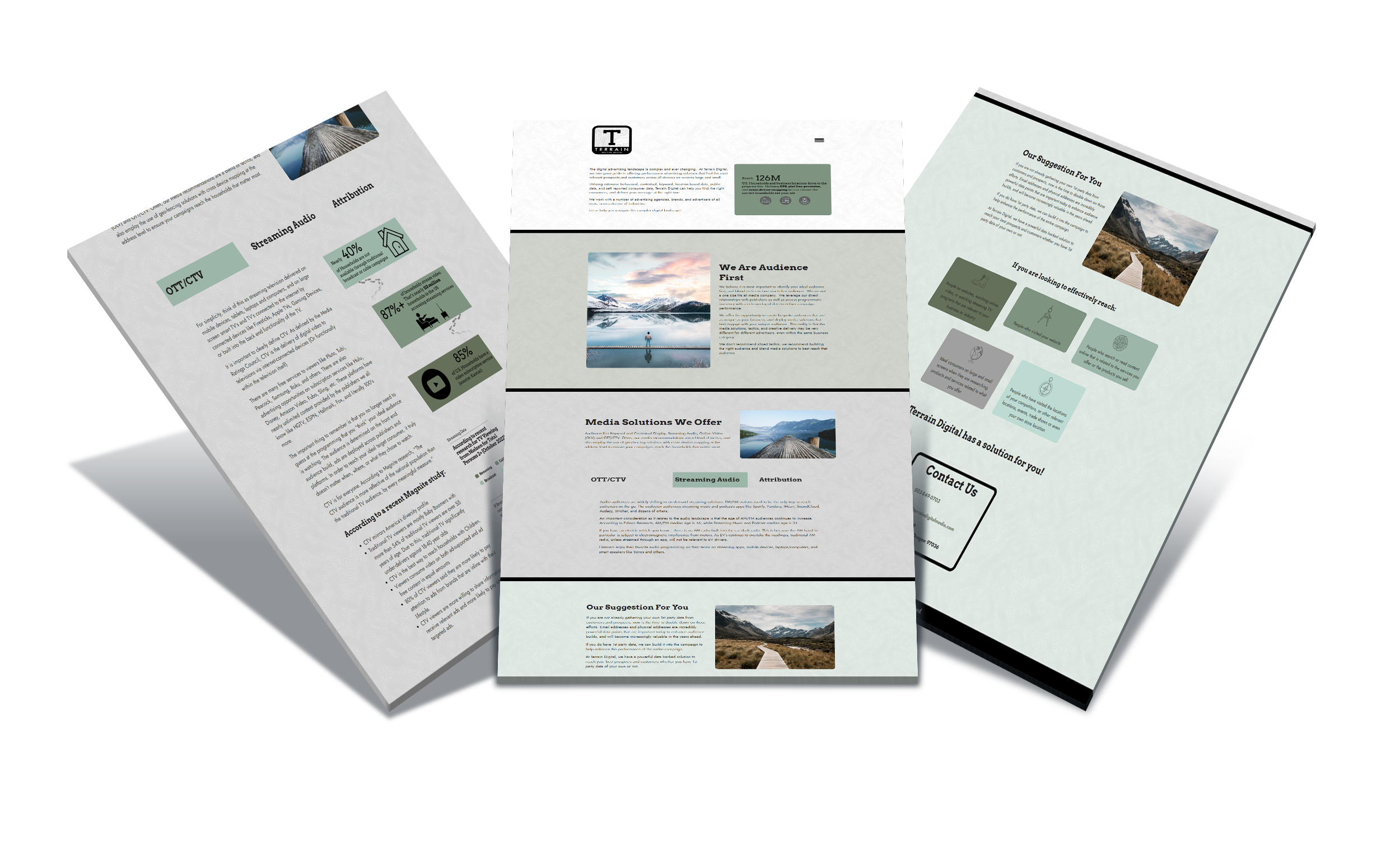
design iterations

final design
The Process
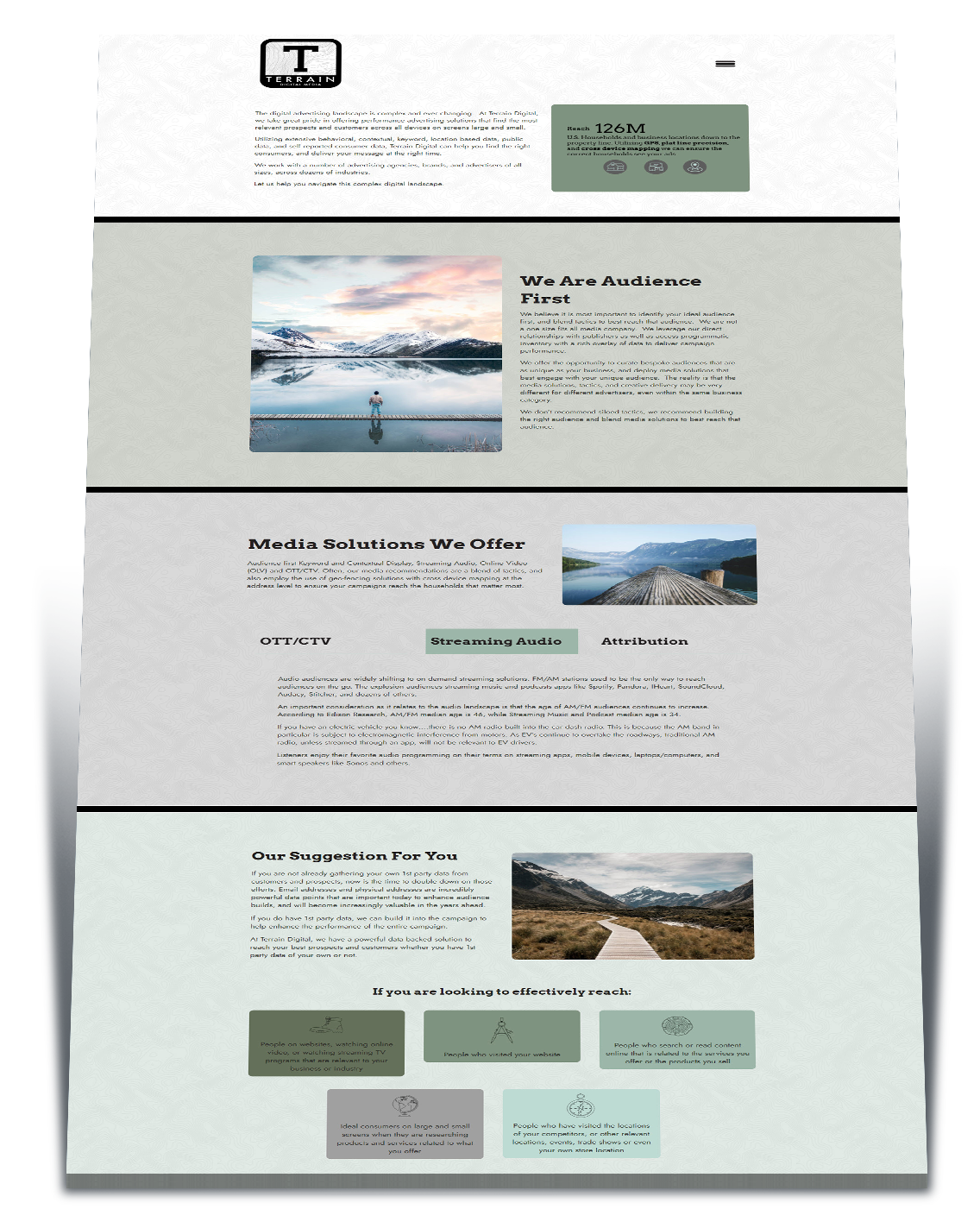
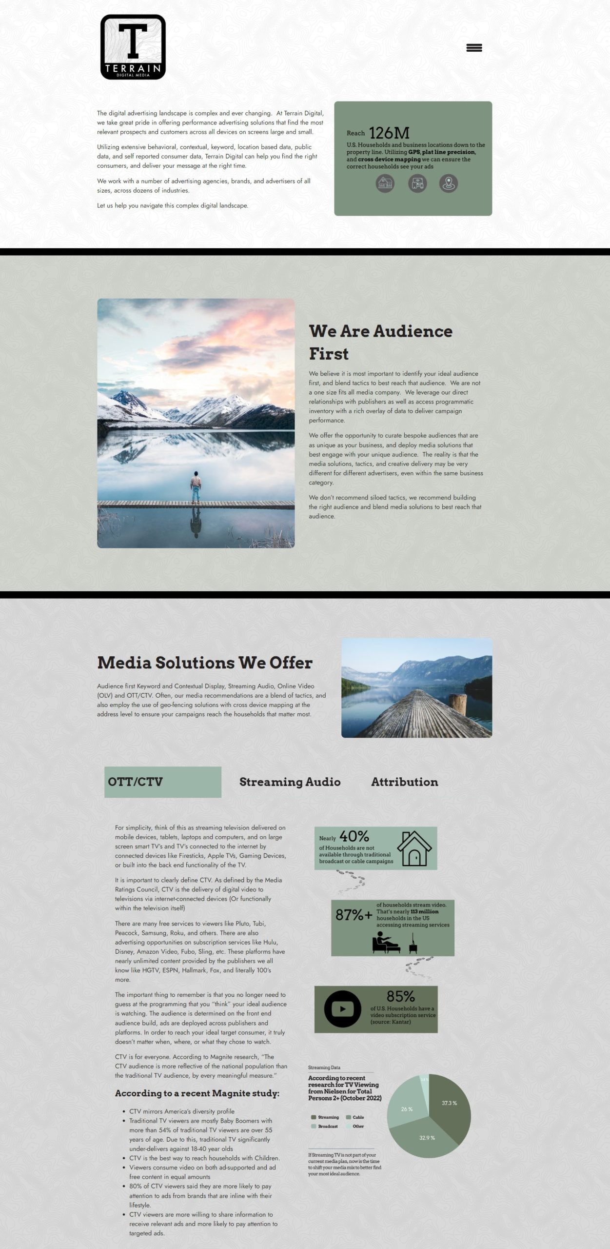
Using the logo as inspiration, I found an image of a topographic map to use as the site's background. For the color palette, I knew I wanted earthy tones to go with the "terrain" theme. I found a forest green I liked (#7f937f) and built the palette with complimentary colors around it.
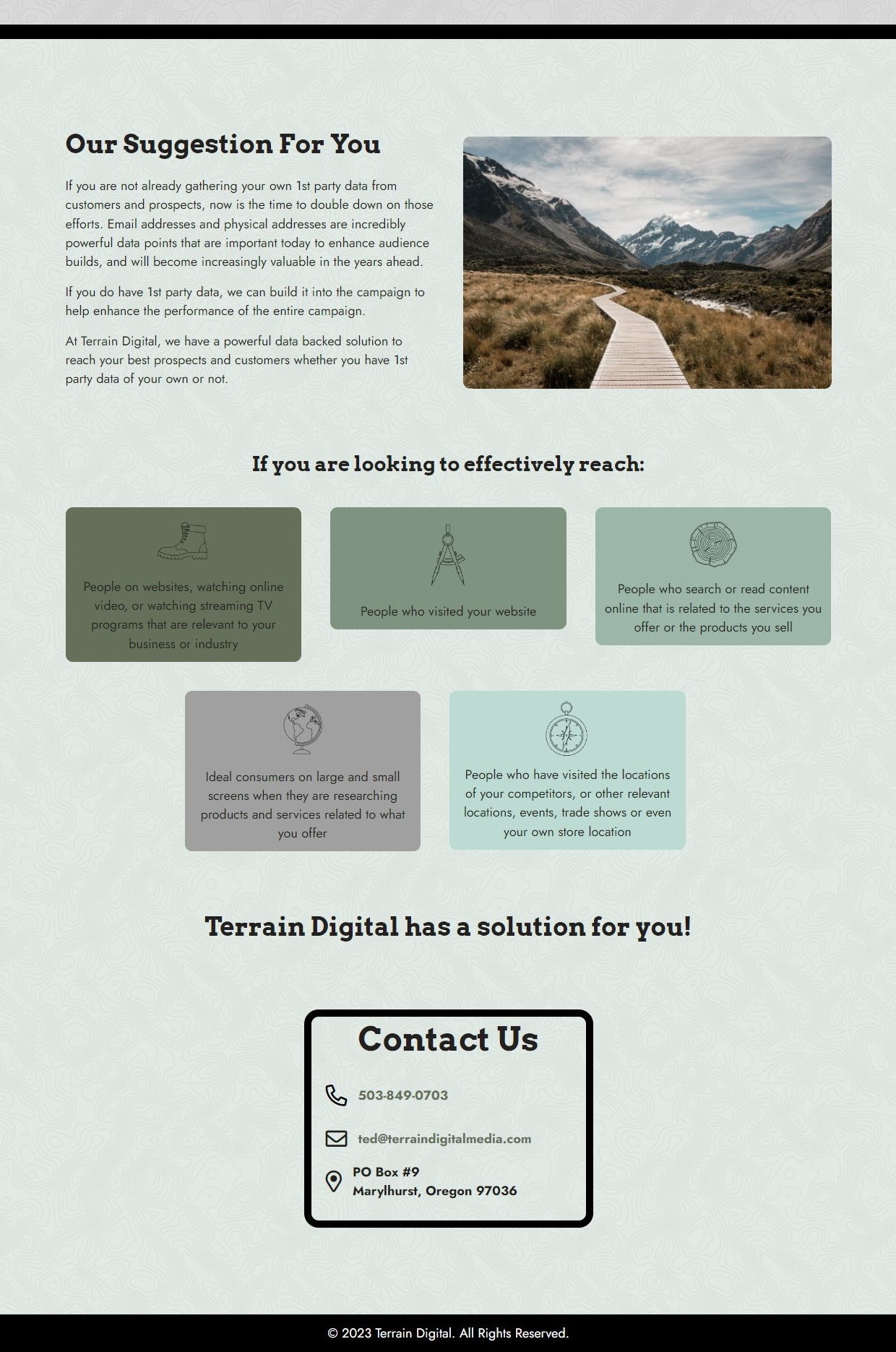
I went through a couple iterations of how to best breakup the page. I tried using horizontal lines stacked with different colors. I also made a page divider using a compass graphic. I wanted to incorporate more color into the site though, so I landed on using a thick, straight horizontal line and taking different colors from the palette to divide the sections. I added some opacity so the topo map background would still be visible.
I experimented with a couple different icons before landing on using the outdoorsy ones in the lower section. I added the color boxes to match the infographics in the previous section, and to bring even more color to the site.
To round out the site, I found some stock images of outdoorsy photos. I choose photos that had some sort of a path going through the terrain to help convey the solutions Terrain Digital offers to help their customers navigate the digital advertising landscape.
Design Touches

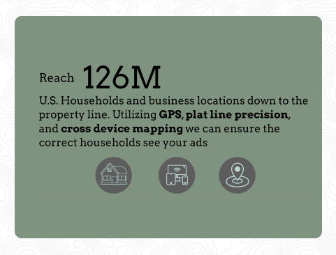
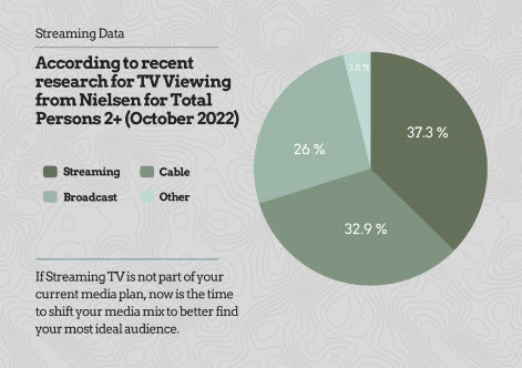
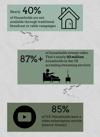
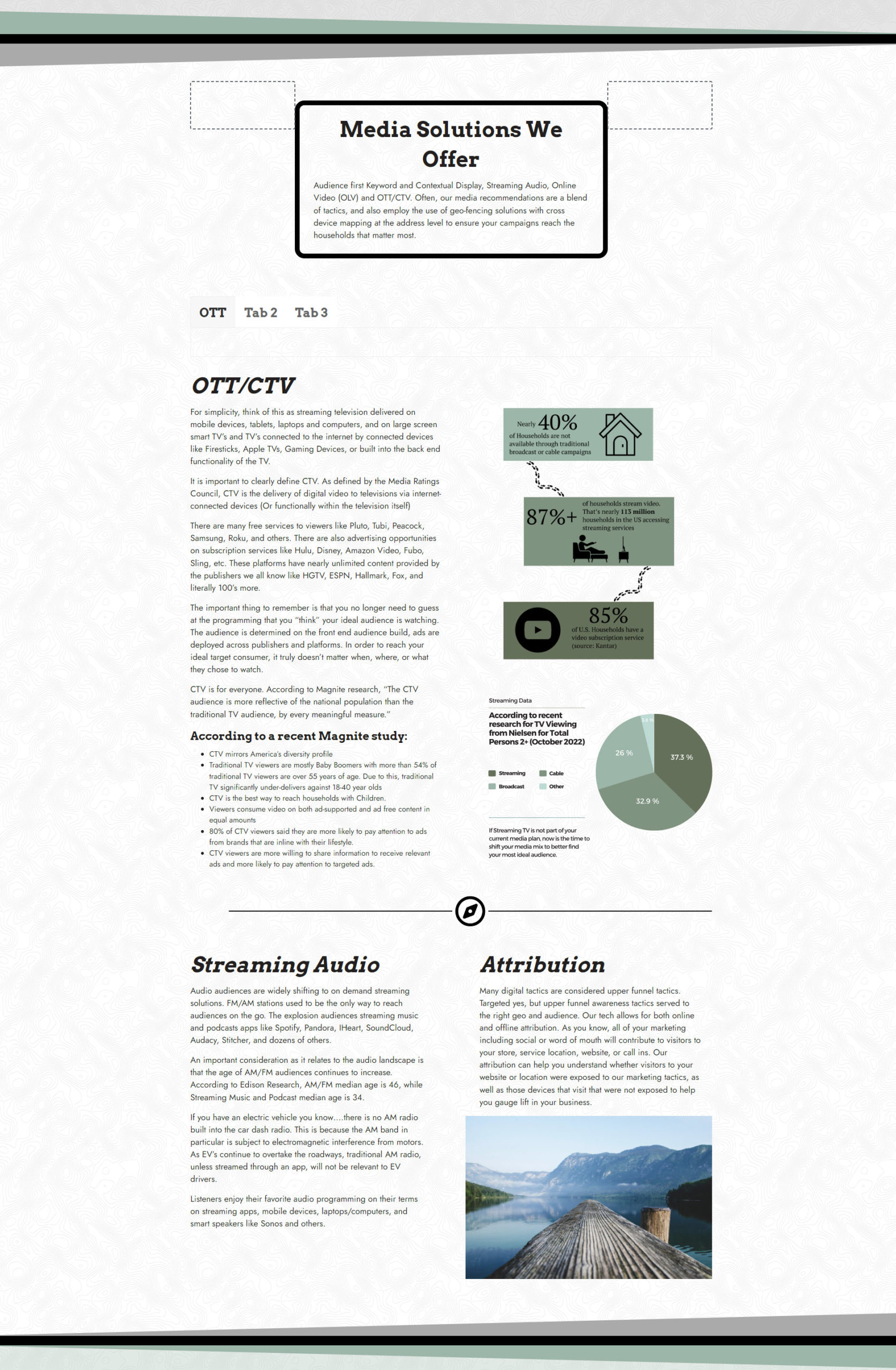
Terrain Digital had stats they wanted conveyed in a visual way. The stats were all text heavy so I tried to use bold, larger fonts and icons to make them more visual. I should have rounded the corners on the rectangles in the third graphic to match the rest of the boxes on the site, but TD liked it as is.
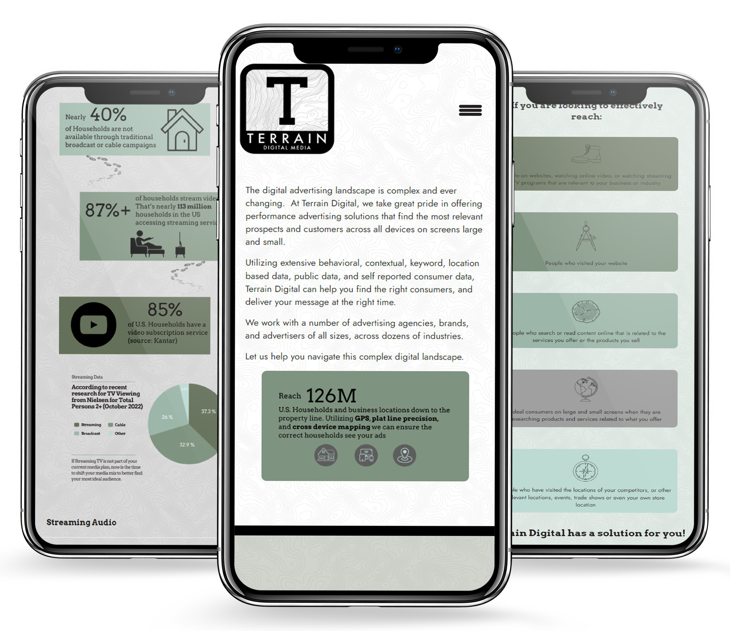
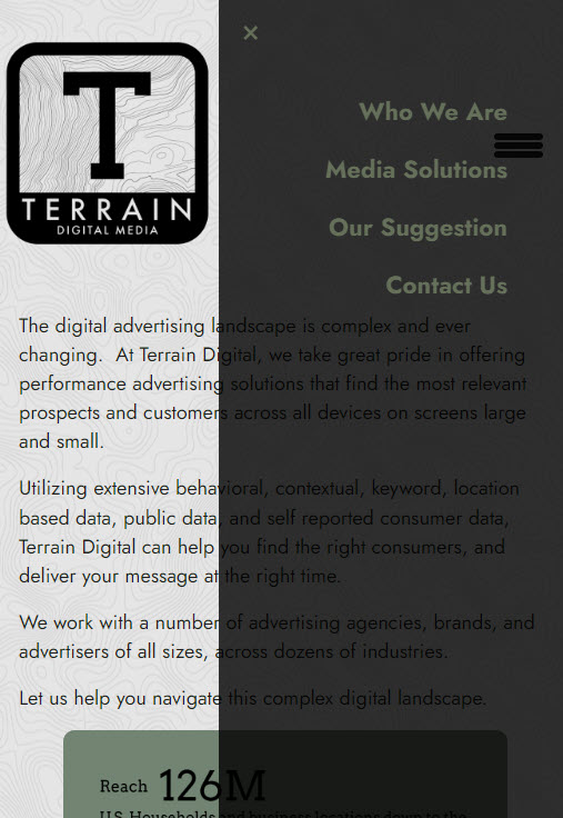
As aways, I optimized the design for various screens.
Mobile Designs
